Saturday, 30 July 2011

Sick of concrete buildings? part 2..

Today, i would like to introduce you guys know about the layout for my activities in the website. First of all, let get a look for my overall layout for my group blog. This is the link for my group blog http://thebimbotics.blogspot.com/ . hope you guys to visit our blog ya...:)


According to the layout, all information icon will be on the left side and ACTIVITIES is fifth icon from the top . To view the activities, you gotta click on the activities link . Are you wondering what you will see inside the activities page ? Look at the general layout below . Do not assume that this is a boring layout ! It seems bore because words and pictures are not filled it . It gonna be totally different when each and every corner is fill up with colours and words.


I had separated the activities into its very own link . For each of the link above, it provides you different information. The main reason , I made the layout in this way because I didn't want visitors to read a bulk of information at the same time and not having time to digest it. I made it in this way so that readers can read each activities separately with sufficient information. They do not need to scroll many times up and down to look for some particular information. 
For instance , click in Marine Park Centre . All information about Marine Park Centre  will be displayed on the content area including image and description that shows the places that are available for Marine Park Centre . Readers will be able to plan out their best Marine Park Centre destination before the holidays.


All the above is layout for my website. hope u guys can understand what i mentioned at above.:)

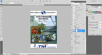
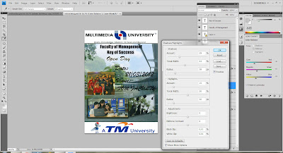
advance layering

This is my last step to do my e wallpaper assignment.


This is the image that i edit before the advance layering...


 The following image is the picture that i did it after edited...


The blending option of MMU logo header is using the drop shadow  and outer glow.


The 4 pictures above is adding the drop shadow effect.


adjusting the brightness and contrast level of the images.


that all for my part of e wallpaper making process for assignment 1. stay back for my future information regarding other parts..:P

Friday, 15 July 2011

retouching part~~

Here i'm going to describe about retouching part that i learned it before in the lecturer class. Retouching is one of the way to change or edit our pictures that need to make some adjustment of it. For this time,you all can learn some new things about the Photoshop again in different way.

As the below, is some of my step that doing some retouching for my pictures :

Step 1~ 

I am using the Levels to Manual adjust the tone to change the darkness and the highlights by using the level 1 of this tone.


Step 2 ~

I am using the color balance to manage the color range of midtone, shadow and highlight skills for my picture that i want to retouching it. You can see that the different between these two pictures when i finish used this tools for it.


Step 3 ~

I was choosing by clicking the "Image" for - Adjustment -Shadow and Highlight tools to manage adjustment to become more clearly for the pictures.


Step 4 ~


For this time, i am using the "filter" style to Sharpen and Unsharp Mask to increase radius and threshold to edit the name of our university.


Step 5 ~

Lastly, for my last step that i retouching my picture are using the Filter- Sharpen- Smart Sharpen to make our university logo to become more dimension and graphic for it. It will let us look like have some different and new feeling for this time.


That all in this section of retouching part that i want to tell you all how to do it and the steps for this part. Hope you all can understand some of this after read through this short briefly introduce of retouching skill. Thanks for get a look of it..And enjoy it ya..^^  :P


Saturday, 9 July 2011

Sick of concrete buildings?

What is so interesting about this place? Why so eager to introduce this island? This because it is one of my final assignment topic that's why! Bimbo final assignment is about Digital Media subject. A group assignment which exist of five members. Our dedicated class leader choose the topic of an island which  required us to promote one of the islands in Malaysia.That's right, where else other than Redang Island!


Aiks! Final assignment can be so stressful! BUT WAIT! The following article is guarantee to open your eyes! You might even open a new tab in your browser looking for cheap tickers from AirAsia right away too! First of all, let me introduce readers about Malaysia. Malaysia is not only a multiracial country fill with natural resources, but also famous for its B.E.A.UTIFUL beaches! Truly asia indeed! ;) Don't believe me?! Check this out!


A perfect getaway destination is our country's very own Redang Island. A must go destination for travelers seeking for an undisturbed, complete relaxation especially for city workers. YES! No more high rise buildings and no more jams! The breath taking view over the ocean surrounded by coconut tress and friendly locals complete with crystal clear blue ocean and white sandy beaches. Great destination for family and friends. Kids are able to enjoy building sand castle while parents take advantage of the tropical weather for some fun activities. Nothing can beat the quality time with families! If you think your skin tone is too pale, no worries! You can enjoy suntanning on the breach in the afternoon! Owh the vitamin D.. Hmmm! After that, travelers can proceed to the busy night life in Redang and discover the fun nightlife and activities that the island has to offer. Couples can opt for a romantic stroll on the breach and appreciate the magnificent view of the beautiful sunset that guarantee to melt the hearts of the viewers. Lucky travelers can catch a glimpse of the turtle laying eggs on the breach too!  (Take note! You can't eat them! Go find yourself some kampung CHICKEN eggs in the market instead. ;) ) Lets do our part to protect the turtles for the next generation shall we? OWH AGREE!


Owh there is more! YES! MORE!


Travelers who enjoy swimming can opt for a once in a life time marine time experience! Owh yes~ You guess it! Swimming with the fishes... Or sharks? (I hope not) Enjoy and experience the peaceful surrounding in the sea with the fishes and maybe learn some of their names too! (Owh of course they don't tell you their names.. ASK AROUND! ITS FUN TO LEARN!) Fun + education, what more can be better than that?! =D In addition to that, travelers can feel the aquatic plants and organism that put a whole new meaning to the world of the underwater. (Owh yes, plants do grow under the sea as well.) The exotic aquatic feeling.. Hmmmm! More to that, travelers can also opt for scuba diving and snorkelling which is perfectly safe! Note to readers: Don't go too far off the coast!


Don't forget to check out our famous Momo Tea Inn, especially if you are not local! Momo Tea Inn is a Laguna Redang Resort that is situated in Redang island. It became famous when it was the featured hotel for a Hong Kong Movie, Summer Holiday.(Check that out!) Since then, Momo Tea Inn is a MUST GO destination for tourists visiting that island. Seeking for a romantic vacation or a honeymoon destination? Look no further! Enjoy the sea breeze in your room and the view of the sunset is.just.amazing!


The following are some images of the activities in this Redang island ....


Turtle Watching Activity

The Image Of The Redang Island..

Marine Park Centre

Momo Tea Inn 

The Decoration Of Momo Tea Inn..

This is the "Summer Holiday" movie that taken in Redang island..


That all for me to introduce this beautiful and nice Redang island in Malaysia. It will going to update at here if getting any new information..stay back!!  :D

Saturday, 2 July 2011

tutorial 2 Layering

Select the pictures that using for our layering~~


Drag the selected pictures, repeating the this steps for the others.


After draging all the pictures into this new photo file, then we can start arranging the pictures. Because every layer is putting one picture, so we need to arrange the picture to make it as a nice looking walpaper.


     i using the "layer style" to edit the image by using drop shadow,inner shadow, outer glow, inner glow and stroke.

After duplicate, I have to change Normal to Linear Burn as more darker background.


This is the complete photo


In this photo I was using six layers in total. The top layer that i put is MMU banner..I do this is because i want to make MMU banner is stand in front to the photo.Besides that, the TM logo that i put at the top of the corridor picture.So that, it will appear on top of corridor picture there.The admin building put at the bottom of the layer,because it will let others of pictures cover at the top of the building.So, that layer will located at the bottom of layer.

Sunday, 26 June 2011

tutorial 1 (selection)

The Pictures That I Choose...

                                              
                                                            Figure 1.0  MMU Banner 


Figure 2.0  MMU Library 


Figure 3.0  MMU Corridor 


Figure 4.0  FOM Lecture Hall


Figure 5.0  The Building of Admin 


                                                    Figure 6.0  MMU Mascot 6666666


Tutorial 1 

In this tutorial, I'm going to teach you the selection process. I'm going to use Adobe Photoshop through this process. After this tutorial, you will be able to select a part of the image that you want from the actual image.

Let us start our tutorial now..
 First,getting your picture from Internet or taking the pictures you want to used for. .All the pictures are different in width and height. So now let me to explain the picture how you are going to edit it.


          Firstly you can using the rectangle marquee tool, magic wand tool, quick selection tools or others selection tools to make selection of the pic. For example: Because the bottom part of the picture you don wan it, the selection tools is make used of picking the part of the picture that you want or the part that you want to deleted.

For example make selection to the sky. because the sky part that i don't want.


                                                    The selection part have been deleted.  


                                                           Make the selection to the sky


  The selection of part have been deleted.


  Select the right corner behind the students.


                                                     The selection part have been deleted.


 After done the selection, you open the new photo file which is in A4 size,by choosing A4 size you need to select  the "present" and set it to "international paper" then go to the "size" set it to A4.


this is the A4 size photo after press the "OK" button..


                                                 And now is time to copy the picture that have been selected just now.


Select the “move tool” and using the command code (Ctrl + C) and go to the new photo there to paste it. If the width & height of the picture is not suit, you can go to the top menu bar by selecting the “Edit-->Free Transform” or either using the command shortcut which is (Ctrl + T) to adjust the height or width. TIPS: to hold the the original ratio, u can hold the "Shift" key to increase or decrease the both height & width with constant ratio.


1)


   To make used of good arrangement of the picture, each picture I was putting as a new layer for it.  So when the future time I want to make any changes wont affect the other layers. 
TIPS: If you want to make a copy of the picture, select the picture layer, and you just need to hold the “Alt” key and drag the picture you wan to. It is the simple way to make a picture copy.


    Coming on with the others picture I was just repeating the steps for the non-changes pictures. 

        That all for the tutorial.hope you all can understand it.thanks for viewing my blog...^^


Tuesday, 21 June 2011

digital media

Hi, welcome to my blog ! My name is Lee Jia Xiang. I'm from Pulau Pinang .Currently i pursuing Bachelor of Marketing with Multimedia in MMU. Digital Media is one of the subject i take this semester. I'm from BC 271B.

To be honest, i do not have any experience in using Photoshop Adobe , Flash and Dreamweaver, but i willing to learn because it seems interesting for me and i believe those software will be very useful in the future.

Last but not least, nice to meet you Madam Lydia!